
A logo is usually the first thing you notice about a business. It appears on storefronts, websites, product packaging, and even business cards. It introduces the brand before a single word is spoken or read. Because of that, its design carries more weight than you may realize.
But not all logos age well. Some are tied too closely to trends, and others fail to communicate what the business actually stands for. A timeless logo avoids both problems, and it lasts because it is built on clarity, relevance, and strong visual foundations, rather than passing styles.
Keep in mind that certain elements, both visual and strategic, come together to give it that kind of longevity. These elements are not based on what is trending this year, but on principles that continue to stand the test of time, regardless of changes in design styles or consumer behavior.
Traits of a Timeless Logo
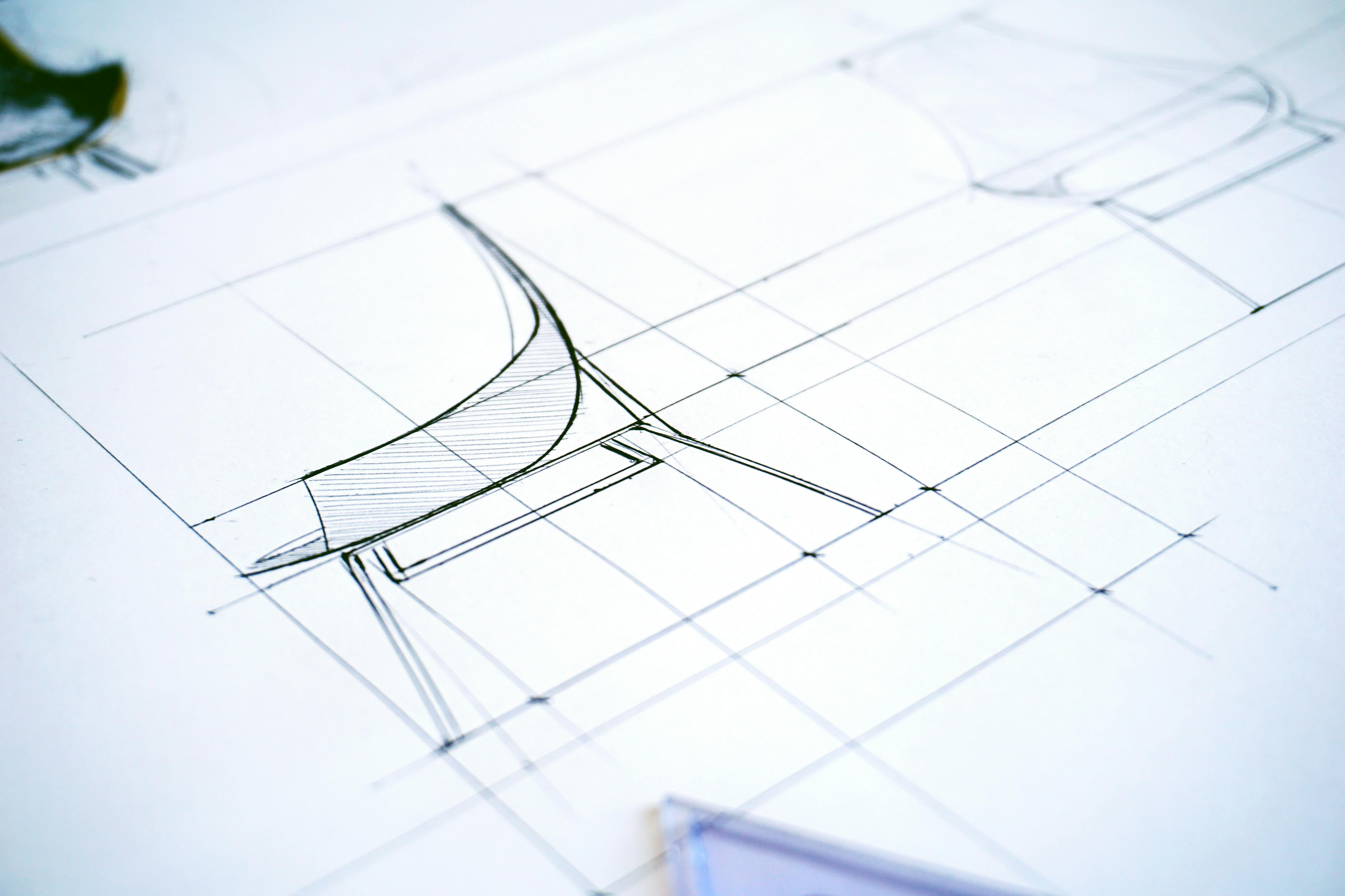
Designing a logo that survives decades requires a thoughtful process rooted in consistency, meaning, and simplicity. That is why many companies turn to professional logo design services to get it right from the start, because a lasting impression is not left by accident.
You will notice that there are several design traits that consistently appear in logos that make their place in the world. These are not tied to current aesthetics but to universal qualities that continue to resonate with audiences across industries and eras.
Here are the foundational traits that contribute to a truly timeless logo.
1. Simplicity Speaks Louder Than Complexity
There is a reason the most enduring logos in the world are typically the simplest. Think of the clean checkmark of Nike, the single-letter “M” of McDonald’s, or the stark apple silhouette with a bite taken out of it. At the end of the day, each design does not demand attention but manages to grab it anyway.
This is because simplicity helps the brain process and retain visual information more efficiently. According to a study, logos that are visually simple are not only easier to recognize but also create stronger brand impressions and are more likely to be trusted by consumers. This matters, especially when consumers are making snap decisions in crowded marketplaces.
Overly complex logos, on the other hand, tend to get lost. They require too much interpretation, which makes them harder to recall and reproduce. They may look impressive in a presentation, but they tend to fall apart in real-world use, such as on packaging, social media icons, or mobile screens.
Meanwhile, a truly timeless logo focuses on what matters most, then strips away everything else. What remains is a design that is clean, clear, and built to last.
2. Originality That Cuts Through the Noise
In a market saturated with logos, most of which are generated by templates or artificial intelligence, originality has become a rare and valuable trait. A timeless logo does not just “look different” for the sake of it. Instead, it carves out space in the mind by offering something distinctive, without losing sight of the brand’s context or industry.
When talking about originality, it does not mean that you ignore what works in a particular field. For example, many tech or financial companies lean on similar colors and motifs. While those elements communicate certain values, they also blend into one another and make brand recognition harder to achieve.
On this note, studies have found that brands that are perceived as unique are 3.5 times more likely to enjoy strong brand visibility and customer loyalty. That uniqueness starts with a logo that does not echo every other player in the space.
Achieving that balance between standing out and not alienating requires skill, insight, and restraint. But when done well, it becomes the visual anchor of a brand people remember.
3. Relevance to the Brand’s Core Identity
A logo does not exist in a vacuum, nor is it just a design exercise. If you give it some thought, you will realize that it is a translation of the brand’s personality, values, and tone into a single visual mark. On this note, most timeless logos are visually strong, as well as deeply aligned with the brand they represent.
That kind of alignment requires clarity at the foundation. Before a logo ever takes shape, the groundwork must be laid, and you need to ask yourself a couple of questions. What does the brand stand for? Who is it speaking to? What kind of feeling should the logo evoke in a matter of seconds?
A playful brand aimed at teenagers will need a very different visual language than a luxury skincare company or a cybersecurity firm. If the tone is serious but the logo is too soft, the mismatch creates confusion. Consequently, if the product is energetic but the design is stiff, the disconnect weakens the brand’s impact.
Strong logos may seem effortless to you, but they are the result of thoughtful decisions that mirror the brand’s deeper characteristics. Typography, color, and even negative space are chosen with purpose. The result is not just a logo that looks “nice,” but one that captures the essence of the business without causing confusion or needing an explanation.
4. Emotional Resonance That Leaves a Mark
A timeless logo represents a company and makes people feel something. That emotional response, even if subtle, is mostly what makes a logo memorable. It may not be logical or obvious, but it lingers and connects.
Remember, great logos evoke trust, excitement, familiarity, or even a sense of belonging. The best ones do not need to spell everything out. In fact, the most powerful logos tend to leave space for interpretation and for the audience to feel rather than just see.
You can take the Airbnb logo. It is abstract, yet soft and welcoming, and it does not directly reference planes, suitcases, or maps. Instead, it focuses on the feeling of connection and shared experience. That emotional quality makes it easier to trust and easier to remember.
When a logo resonates emotionally, it builds a layer of meaning that goes beyond aesthetics. Eventually, that feeling becomes attached to the brand itself because people are not just recognizing a shape but remembering how it made them feel.
Why Timeless Logos Still Matter in a Changing World
While a logo may be small in size, its impact on a brand’s success is anything but. It is the visual handshake and usually the most repeated element of a business’s identity. And while trends in design will come and go, the logos that last are built on clarity, originality, emotional depth, and alignment with the brand’s core identity.
However, creating a timeless logo does not mean avoiding change or innovation. It simply guides you to resist the urge to follow what is popular today and instead focus on what will still make sense and make an impression, years from now.
Whether for a new business or a brand seeking a refresh, a well-designed logo can influence everything from first impressions to long-term recognition. And while simplicity, relevance, and emotional resonance may sound like abstract goals, they are entirely achievable with the right expertise and process behind them.
At the end of the day, timeless design is a way for you to be true to the brand, to the audience, and to the message that needs to be carried forward.


